Galápagos
Branding Redesign
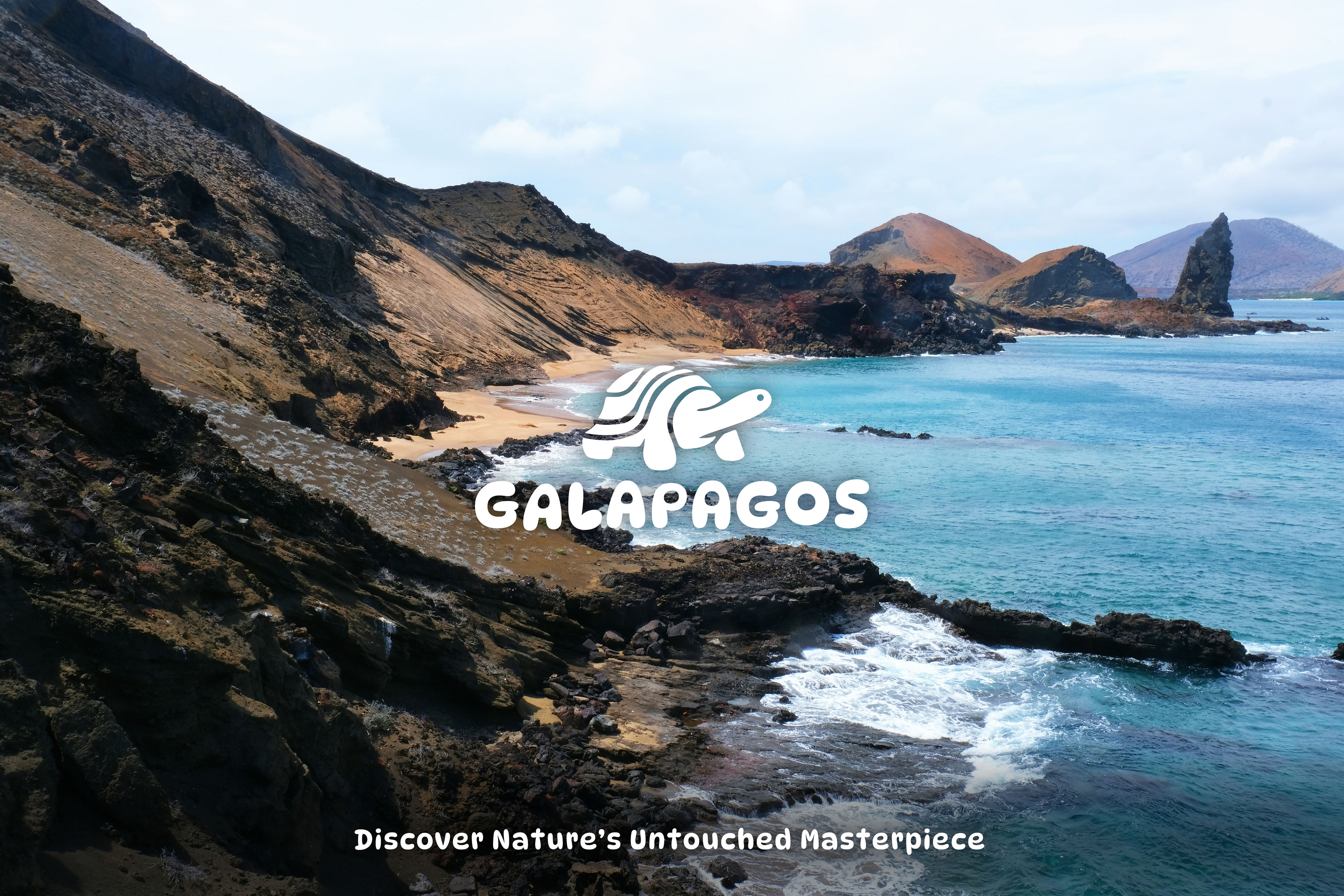
The Galápagos Islands have always been a dream destination for me. As a designer with an Ecuadorian background, I wanted to reimagine the branding of a place from where my family calls home.
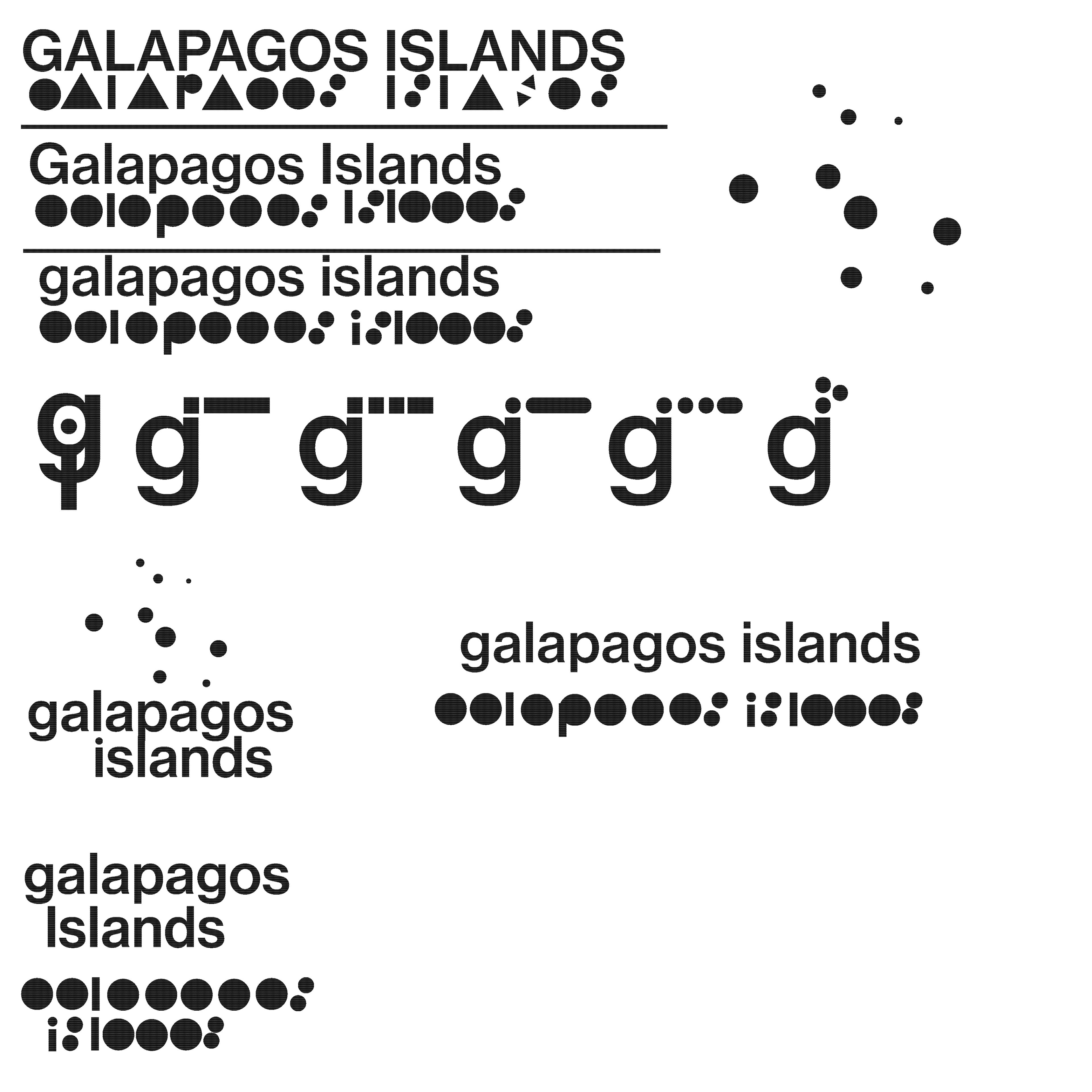
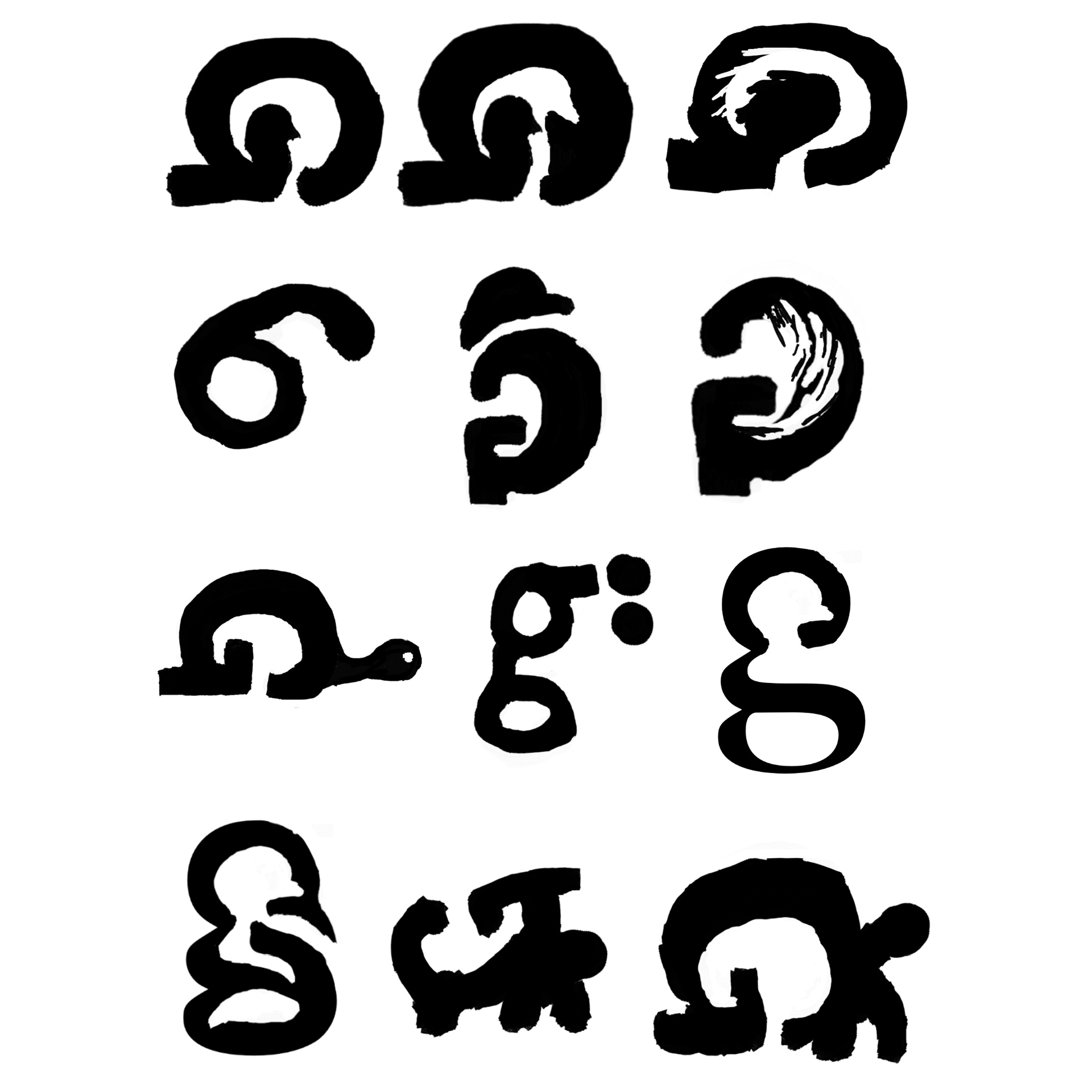
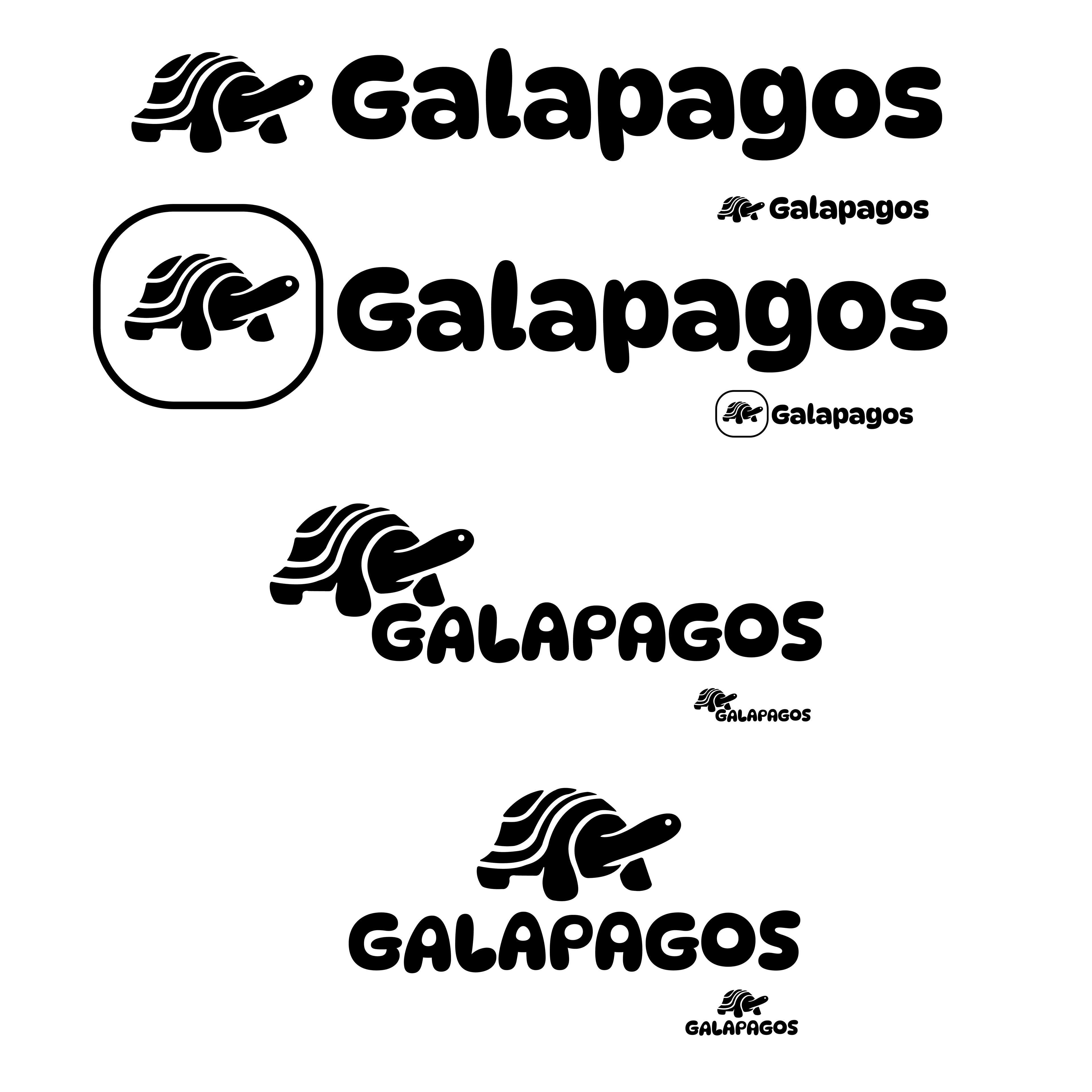
My process began with extensive sketching, exploring different visual representations. I focused on the iconic Galápagos tortoise, a symbol of the islands, and experimented with incorporating a circular outline of the archipelago. I was drawn to this circular motif and discovered that the letters in "Galápagos" naturally formed rounded shapes. This led me to develop a design language inspired by circles—reflecting bubbles rising through water—set against a blue background. The combination of blue and green felt like a natural choice, evoking the islands' rich landscapes and marine life.
Circular outline of the archipelago

Sketches
Sketches
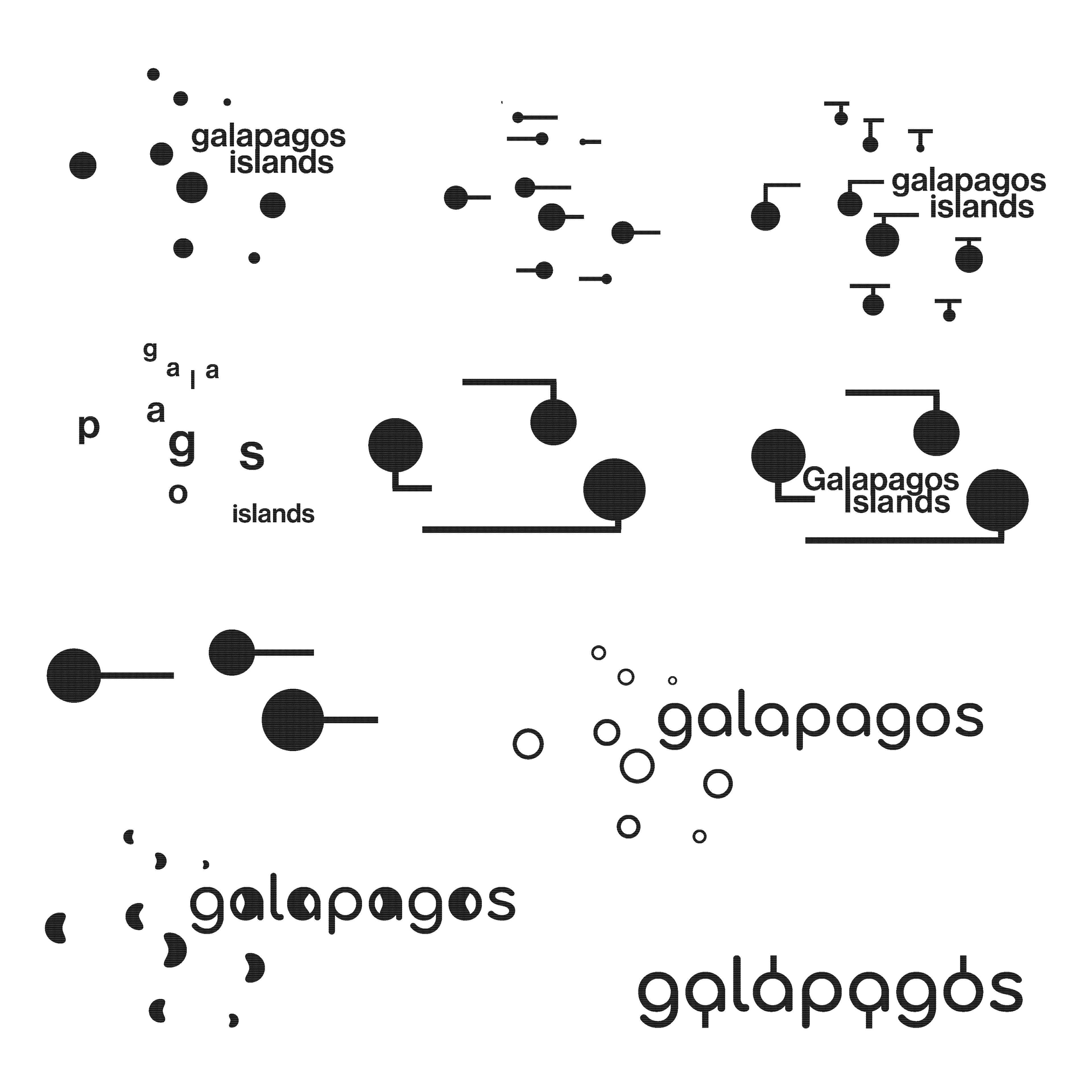
Exploring Circle Idea

Exploring Illustrations

Narrowing down on Illustration

Illustration Details in Small Scale Study
Type and Symbol Exploration